a while ago i went to a park to try and take some photos with fall colors. didn't work as i had hoped in various ways - c'est la vie - but did come out of it with a finished roll of 120 film. overall probably still good that i went. much to consider.
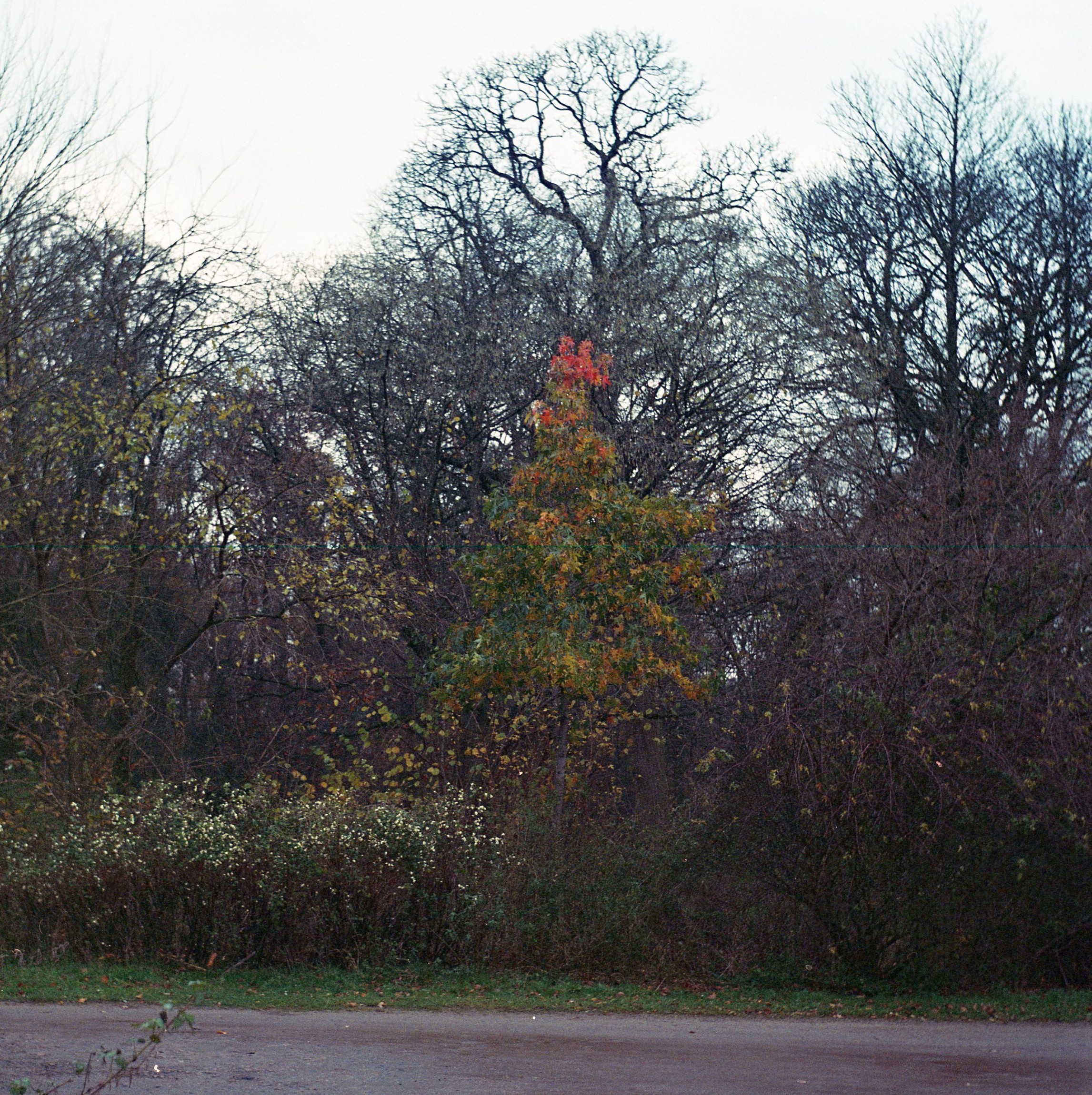
here's the most "fall colors" style photo i got.

it's another "they should have sent a painter" shot. i sure like that red highlight in there! but i feel like it gets pretty lost in the frame, like there's too much stuff going on, the surroundings too detailed and minute and that draws attention away from it. i don't know if that's really happening, but i've had that feeling a bunch of times when i've tried to capture a colorful detail surrounded by brush. how about this:

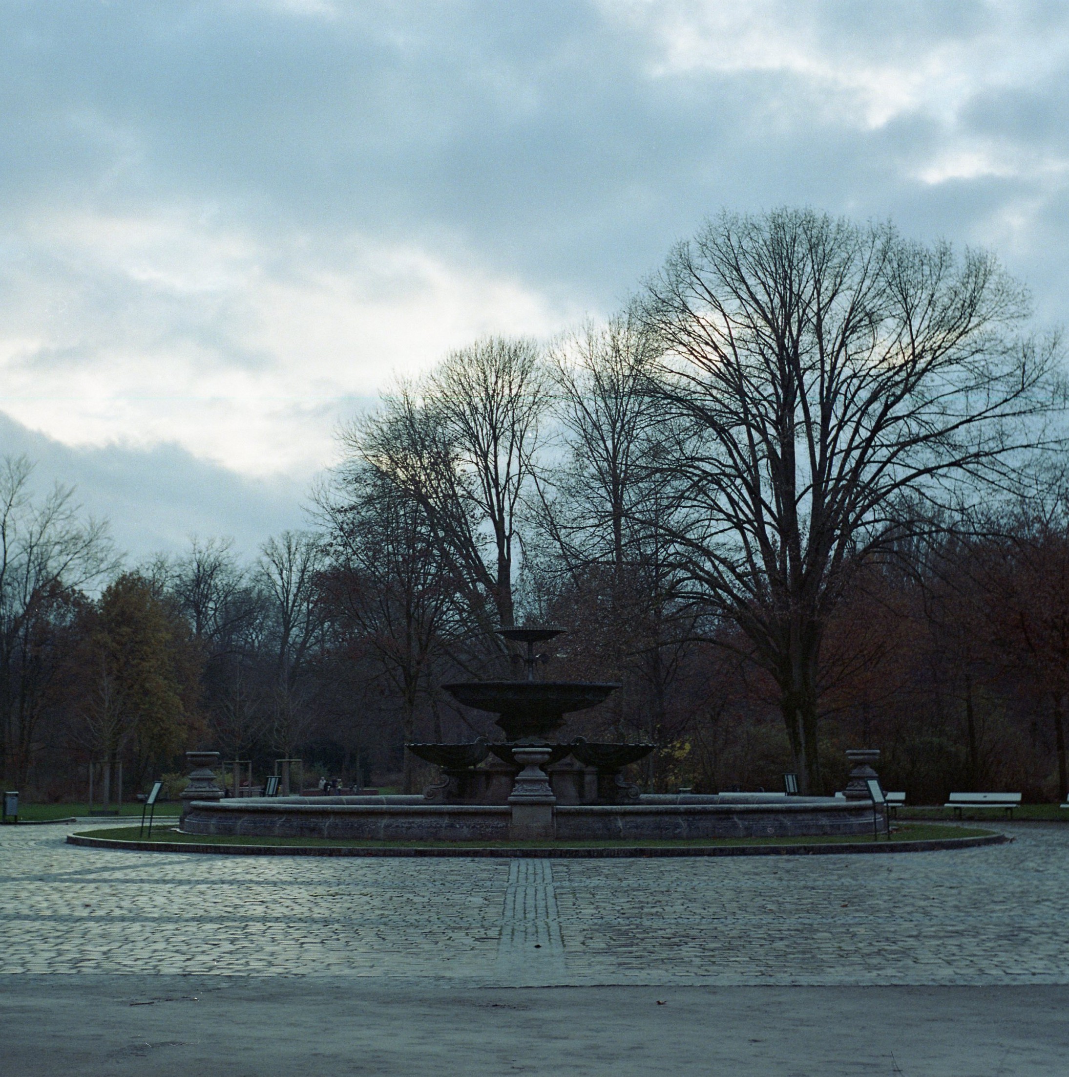
trees are mostly bare first of all. not very nice of them when i came to see them! okay regardless. that fountain is nice but would be more striking if it stood out more from the background, no? it should probably also be framed differently in that case but just on principle. though the atmosphere would also change quite a bit i think. maybe it would feel more imposing and less desolate. something something.
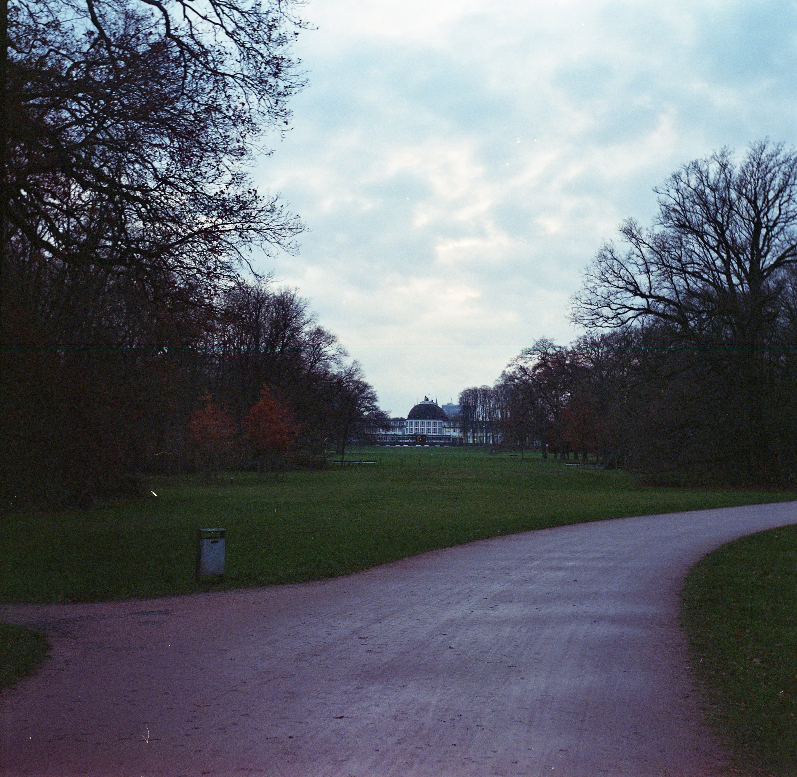
these two photos i actually also cropped - though i kept the square aspect ratio - because they weren't centered like i had wanted them to be. this roll, like the previous, was shot on my agfa isolette. maybe it's the viewfinder or maybe it's the ancient linkages and such but this happens sometimes. going through these photos i was also thinking that i might just be better at framing things in a wider format anyway - don't know if that's true, might should look around my back catalog. i've been thinking that i should really take out one of my SLRs again sometime anyway.

the bench. i was setting this shot up to be slightly disappointing because the cobblestones are slightly misaligned from the center of the bench. turns out that doesn't stand out much because the entire shot is tilted. i could probably fix this but i don't want to use a program right now. feel free to tilt your head slightly, as i am.

had to put all my skills of composition into this one for our main attraction: garbage.
you will gotta give me this though: those trees stand out just a little due to being red. that's a fall colors baby.

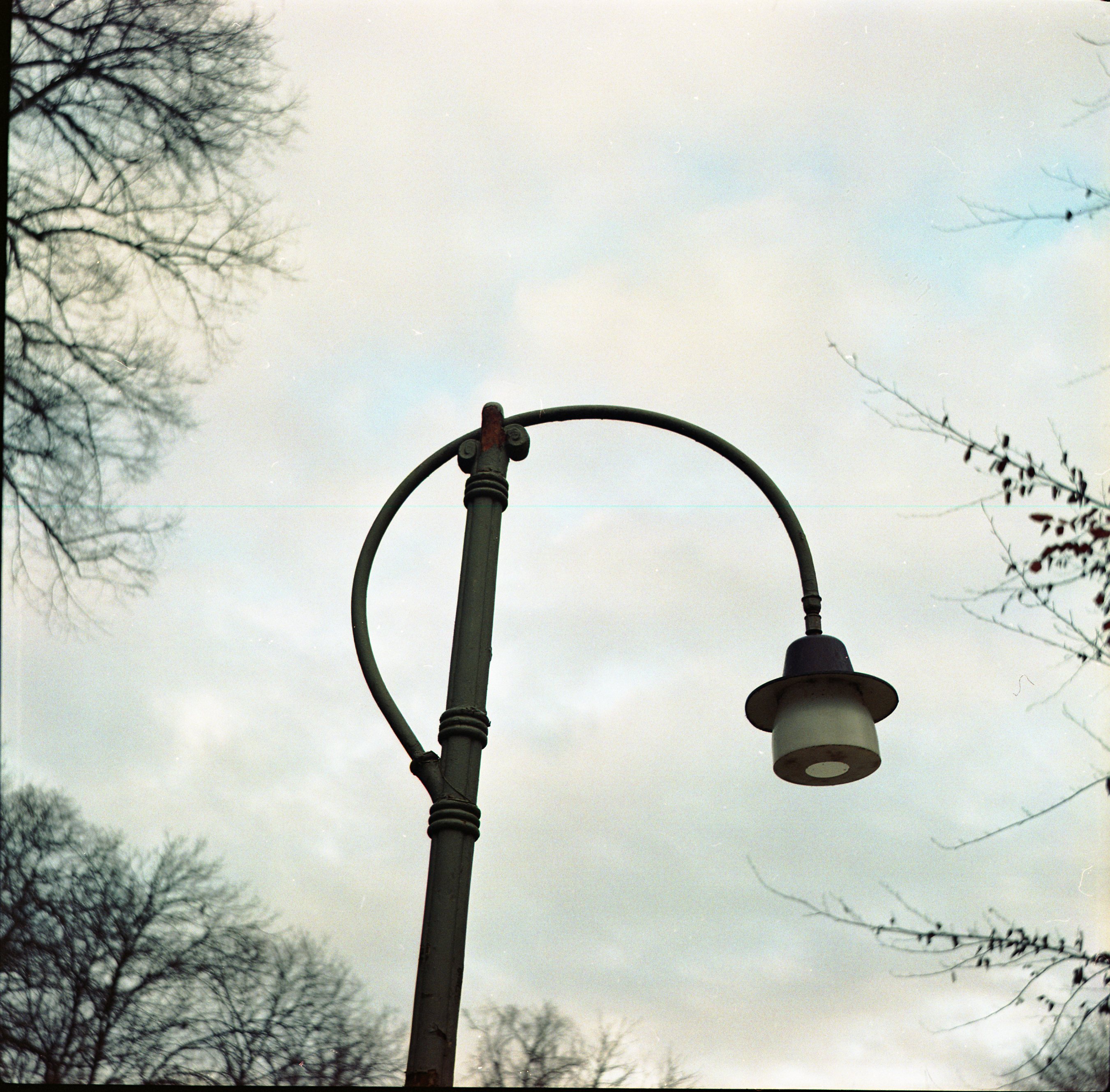
this lamp... it's a nice design, i like it. i was looking around a bit to see if i could find a good photo around one of these. this one is corroded in a bunch of places but the only one i could fit into frame with the design is up there, and it's a bit hard to see against the sky i think. this probably is the best framing i saw but it feels a bit matter-of-fact.

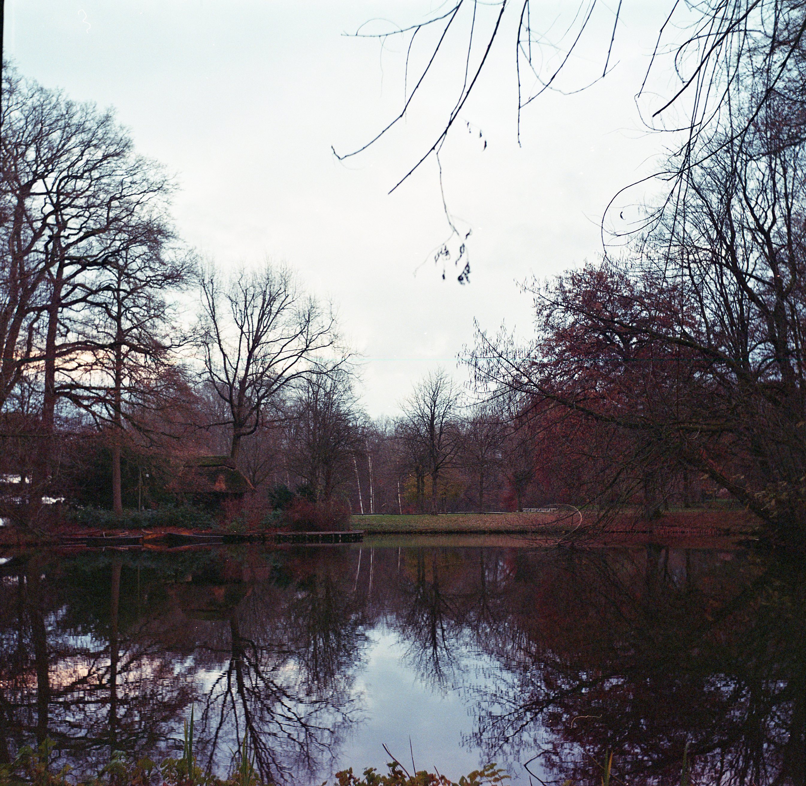
generally like this one. i seem to like to have things dangle into large areas of whitespace at an almost even distance from things. that little hut and its reflection were really supposed to be the main attraction and i think that's a good place to put it.
i meant to mention this but just forgot until now - this is lomography color 800. i've not been super into lomography film so far (though i should try turquoise/purple again sometime) but this just seems really normal. saw some rumors that this is just portra 800 - honestly do not have the eye to confirm or deny. all i know is that lomography put all their 120 film through the machine that makes it so so bendy and difficult to work with.
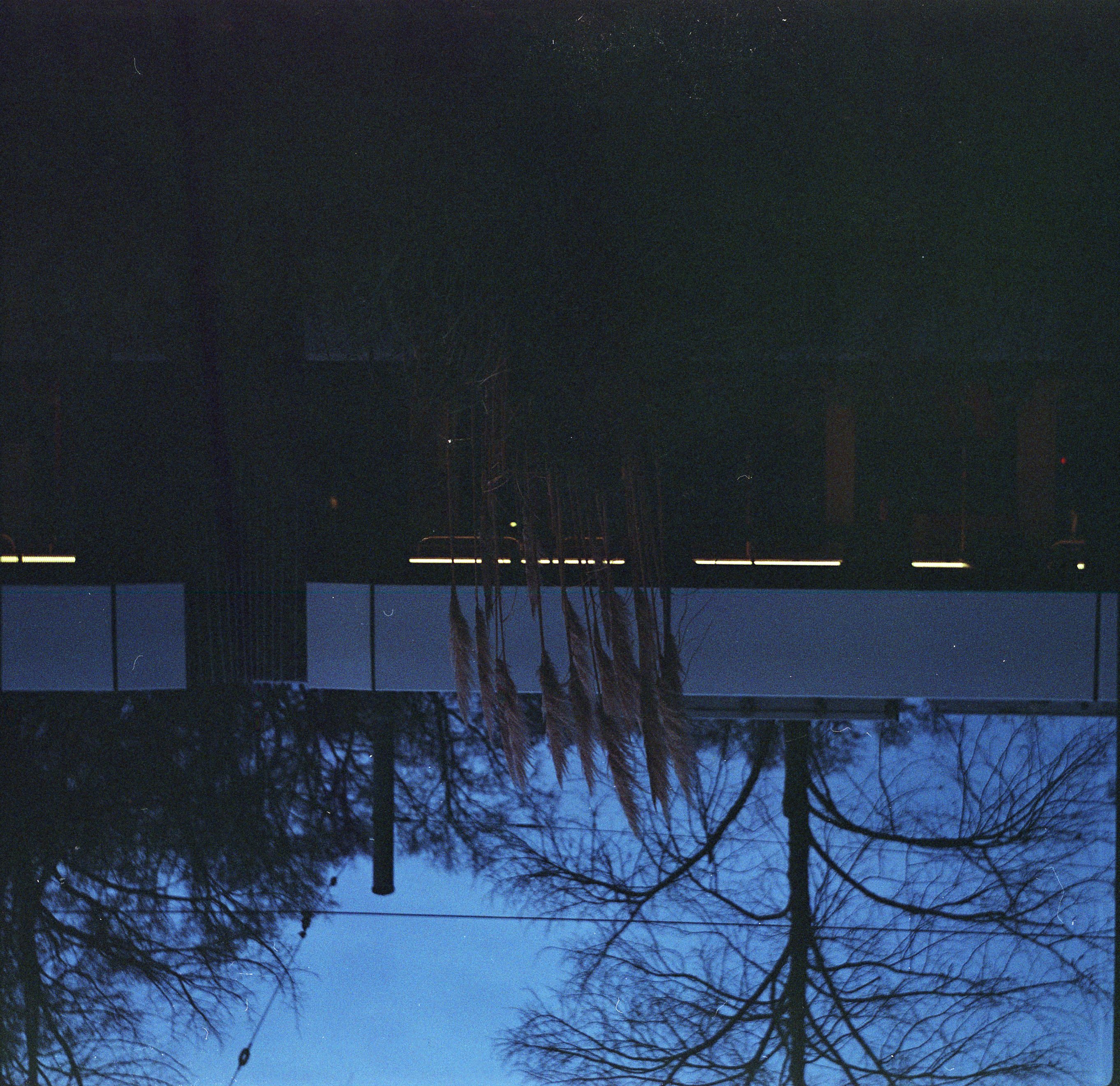
alright just skip a few and cut to the chase. this one is my favorite from the roll.

this is from when i was already on my way home. i've really taken a liking to these grasses lately. i was circling these to see if i could get a good shot of them but there wasn't a good backdrop i could see. but then this tram pulled up and stopped behind them! a cyclist slowed down to not get in the way and gave me like an "alright man sure" type look. and fair enough! i can't explain this shot! it had gotten darker and i still don't have the feeling to adjust for that right so it's underexposed. i think that might just work quite well here though. should maybe try to actively work that sometime. i've seen a bunch of photos where i've thought that they look good in part because they're underexposed. don't know what the magic is, but i see just a little of it in here. i like the vagueness of the grass stems and the interior tram lighting being a clearly defined highlight. as i think i recall a wise computer program once telling me: embrace vagueness.
okay i'm tired i don't really know what i'm talking about anymore. last point of order: does the presence of 📸 imply non-photo posts? it sure does. though the one i have in mind now ironically involves flash photography where this post did not. i should have that out like a week ago but i don't. should be here soon. stay tuned if you've always wanted to ask the question: what
